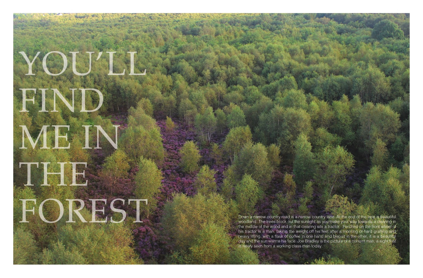
‘The face’ magazine by Neville Brody (1990)
I constantly referenced my work throughout my project and looking at designers such as Neville Brody for direction, he is perhaps the best known graphic designer of his generation with work on ‘The Face’ magazine (1981-1986) as well as ‘Arena’ magazine (1987-1990). Brody is recognised as one to the most influential graphic designers of the late 20th century, with a post modern style. Well known for his use of typography, Brody’s opinion was that people read magazines in a different manner from the way they read books, his idea was that they didn’t read it straight through from the beginning to the end. Readers tend to go back and forth picking out the interesting bits. Brody focused largely on typography with the desire to highlight interesting sections of articles and attract the attention of the reader. Keeping in mind Brody’s idea of attracting attention, this encouraged me to spend time designing eye catching layouts for the pages with strong messages that I wanted readers to stop on whilst they flicked through the magazine.

National Geographic (2011)
Theres nothing I appreciate more than good photography, Instagram is an incredible app that allows me to follow my favourite artists, designers and photographers. One person who has been a huge influence to me and my work has been Jimmy Chin, a professional climber, mountaineer, skier, director and photographer. He is best known for capturing adventure sport athletes on epic rock faces or mountain tops, it was his jaw dropping scenery shots that inspired me for this project. It reminded me that although the sport is fun to take part in the scenery that you get is just as rewarding when your on the top of the mountain. He is best know for his sponsorship with The North Face athlete team and has been featured both in front of and behind the camera in numerous publications, including National Geographic, Outside and Men’s Journal. His photography is intense and daring, outspoken and challenging, he strives for a greater understanding of what we can push ourselves to and what we can consider a comfortable boundary.

‘Cereal’ Vol 3 (2013)
My uncle is a designer and a person I appreciate the guidance of, over the years he has directed me down the path of many designers and inspirational artists, one editorial piece that he has shed light on is the magazine ‘Cereal’. Published twice a year, it has been divided into chapters based on cities, filled with stories about, places, people and products, along with striking photography. The particular one that I was most found of was Volume 3 the cool calming colour blends well with the minimal style of the entire magazine and their constant use of negative space is an excellent way to capture the attention of the viewer, when there is balanced negative space it allows for effortlessly evaluation and appreciation of design.