Tuesday, 26 April 2016

Page 1 . 2 . 3


Arrangement

I prepare image 3 as it is laid out in a way that focuses on the image and the text draws the eyes naturally to the centre of the image. I chose capital letters because they hold their presence on the page but the opacity has been dropped so that the font doesn't take all the attention on the page.

I resized image 3, it has the correct positioning on the page that I desire but I would like it slightly smaller on the left hand side.


Sunday, 24 April 2016

Page samples


Choosing which style works best with these images is tricky, the image on it's own I feel is strong and can hold the presence on the page by itself without text but this is the page that I had designated for the title of this article.

Friday, 22 April 2016

Personal writing section

Experimenting with different layouts to see what layout and style works best, because this page is unique from any other page, it isn't another article spread but instead this is my own personal spread. The idea is to express myself through minimal design without taking away from this rest of the magazine but still let the reader see where my ideas and what my perspective is. 


I decided to remove the second image and just have the one, it looked better balanced, natural and some what.. organic. Final look:

Wednesday, 13 April 2016

References

‘The face’ magazine by Neville Brody (1990)
I constantly referenced my work throughout my project and looking at designers such as Neville Brody for direction, he is perhaps the best known graphic designer of his generation with work on ‘The Face’ magazine (1981-1986) as well as ‘Arena’ magazine (1987-1990). Brody is recognised as one to the most influential graphic designers of the late 20th century, with a post modern style. Well known for his use of typography, Brody’s opinion was that people read magazines in a different manner from the way they read books, his idea was that they didn’t read it straight through from the beginning to the end. Readers tend to go back and forth picking out the interesting bits. Brody focused largely on typography with the desire to highlight interesting sections of articles and attract the attention of the reader. Keeping in mind Brody’s idea of attracting attention, this encouraged me to spend time designing eye catching layouts for the pages with strong messages that I wanted readers to stop on whilst they flicked through the magazine.

 National Geographic (2011)
Theres nothing I appreciate more than good photography, Instagram is an incredible app that allows me to follow my favourite artists, designers and photographers. One person who has been a huge influence to me and my work has been Jimmy Chin, a professional climber, mountaineer, skier, director and photographer. He is best known for capturing adventure sport athletes on epic rock faces or mountain tops, it was his jaw dropping scenery shots that inspired me for this project. It reminded me that although the sport is fun to take part in the scenery that you get is just as rewarding when your on the top of the mountain. He is best know for his sponsorship with The North Face athlete team and has been featured both in front of and behind the camera in numerous publications, including National Geographic, Outside and Men’s Journal. His photography is intense and daring, outspoken and challenging, he strives for a greater understanding of what we can push ourselves to and what we can consider a comfortable boundary.


‘Cereal’ Vol 3 (2013)
My uncle is a designer and a person I appreciate the guidance of, over the years he has directed me down the path of many designers and inspirational artists, one editorial piece that he has shed light on is the magazine ‘Cereal’. Published twice a year, it has been divided into chapters based on cities, filled with stories about, places, people and products, along with striking photography. The particular one that I was most found of was Volume 3 the cool calming colour blends well with the minimal style of the entire magazine and their constant use of negative space is an excellent way to capture the attention of the viewer, when there is balanced negative space it allows for effortlessly evaluation and appreciation of design.

Monday, 11 April 2016

Walk around Drumnaph

Drumnaph Community Nature Reserve

Drumnaph Community Nature Reserve consists of a mix of habitats and three walking trails to choose from. The Woodland Trust owns approximately 80 acres of Drumnaph Wood, which is located to the eastern side of the reserve. This section contains both ancient woodland and newly planted woodland as well as some wetland habitats. In early 2012 an opportunity arose to secure the purchase of an additional 130 acres in the western section of the reserve, which includes a patchwork of ecological habitats including ancient woodland, wildflower meadows, ancient grazing habitats and wetlands.


Articles

I found a really interesting article online about how people in the wild rely too much on technology and the stories that have come from these life changing or life ending stories. It was an interesting read, extreme but relevant to the topic I am focusing on, even though I am not dealing with a life ending issue in the Sperrins it was the message that stood out to me the most; Our Reliance on Technology makes the backcountry (or outdoors) more dangerous.


Also the website Outside Online is a great way for me to stay connected with what's new in the outdoors and interesting articles that have been written about educating ourselves to be safer and more clever in the great outdoors, just like the article above.


Beginning digital layout


I am working within Illustrator as my software tool for this project, I am confident using it and that takes away a lot of the pressure when you are confident with what you are using. Above I have my two page spread for the 'Outdoor lifestyle' chapter within the magazine, I contemplated using other images for this but I absolutely love this image, I am also using this image as my cover photo so it's nice to be able to show the full image inside the magazine. This layout works really well for both chapter pages, the white box around both pieces of text with grey text.


Youtube interviews

I follow a lot of Youtube channels, from extreme sports to film makers, daily Vloggers to designers, I LOVE Youtube. The channel's that I really enjoy following are;

Patagonia
Salomon Trail Running 
The North Face
JacksGap
Fun for Louis
Casey Neistat

This channels help me to get inspired to design, travel, exercise they help me to get motivated and to create. I also follow Youtube creators that have interviews, a few from the list above have great powerful interviews and stories that help when I am planning my questions and preparing for my interview. One channel that has stood out to me the most in a channel run by a girl by the name of Sara Dietschy I stumbled across her channel in recent months when I found a video of hers. 

Sara has an episode on her channel called Creative Spaces TV, she interviews a bunch of creative people and how they work in the space that they have and what their career is. It inspired me so much when I was having a lull moment when I needed some inspiration and motivation to do my interviews. 

This video really inspired me to work on my project.

Other videos that I loved, although I am not making a video I have used the tips and trick during my own interviews.

The Ultimate Fan
On the Road
Of Fells and Hills
Kroger's Canteen

Musician's Extra Footage
Photographer Full Interview

Updated front cover

I originally used the front DK Semarang for the logo on the front cover of my magazine but the more I looked at it the more I grew to dislike it. So I went back into Illustrator to edit it, I was happy with the image and felt that it was strong and worked very well I then began to work with the type face and used Gotham Thin, it looked a little too thin but I didn't like the look of this font in regular so I made a sample copy with a line underneath the font. It was this sample that I asked my class mates for their opinion on. 

First design:
This was the edited version of my front cover after I made the changes that the guys made, I tried the thin box around the type, just like Adam had suggested but I felt that a thicker font was going to work better without the line.

Now I have my finished front cover; I wanted to keep the text white for a clean sophisticated look, I felt that you could read it and although it is not the easiest to read straight away that allows for curiosity and keeps the reader interested to open and read on. The sky is dark enough for the clean white to stand on its own without a box or line now that I made the text thicker. 

Tuesday, 5 April 2016

Organising


At this point I am waiting on my Rg1 application form to be complete in order to continue with my project, this has forced me to focus my time on planning, planning planning. I have all the articles planned for the way in which I want to content to be laid out, I have focused on my photography and perfected all the interview questions so that I can make the most of the time that I spend with each of the interviewees. 

Image editing


Once I got back from a photoshoot I would take all the images I had from my camera and put them onto my laptop and back them up on my hard drive, this allowed me to have a better look at the images I took as well as being to choose the images that I was going to edit. Every photoshoot, day out, hike, event had it's own folder and it was labelled with the date this allowed me to stay organised and made for much easier planning. I wrote down the number of the image that I wanted to edit and from there I was able to keep track of each of the shoots.

Layout


By creating this grid format, it allowed me to stay organised. I was able to layout all my content and then tick it off when I knew I had a place for everything and it allowed me to see where I had extra space. I am a very visual person and being organised is one of my specialities, therefore this method is something that has worked in my favour for this project. I love digital work, I can see when my work is coming together when I have it on my laptop but in order for me to use my time wisely I needed to go back to the drawing board for this project. 

Monday, 4 April 2016

Introduction page

That feeling of being fully emerged in natural surroundings is something that no amount of money could ever buy. 

I designed my project through my combined fields of interest within design, photography, graphics and typography along with my hobbies that I am involved with in my spare time such as running, bouldering, hiking and camping; therefore creating an "outdoor lifestyle and creative culture" magazine used to inspire people.

The idea to create a magazine was something I was very interested in, I love reading books in my spare time and to combine all my interests into one printable magazine would be a dream. The reason to make it a print rather than digital also was very important to me as I feel that we have become a society who are super connected with this fictitious world and completely disconnected from the ‘real’ world, over engrossed with our phones, laptops, TVs and tablets. By making this a printable form, it can be an item that you take with you on your next weekend break or hike; filled with examples that people can survive without always being connected, highlighting those individuals who have lived their whole lives from the land.


The data that I will gather will be used to form articles that help to explain the experiences of those who have grown up in the beautiful surroundings that is, Sperrin, piecing together both the stories and memories of recent times and times long ago. The purpose is to educate those within this area of the upbringing that came before them and for people who are interested in learning more than what the tourist signs tell them.

Personal content

My love for the outdoors stem from a young age, the feeling of being completely emerged in nature was more rewarding than any number of play station games or gifted toys at that age and it seems as if nothing has changed swap the games and toys with a night of clubbing and I would still choose the freedom of hiking An Carn. I never felt that we had any restrictions growing up except being home before the street lights came on; a healthy doss of freedom to wonder and discover new places, to make decisions for myself and see the consequences, thats my definition of a balanced upbringing. 

I notice myself going for a run when college work gets to much to handle, a short walk or something as simple as taking the time to stand in the back yard and watch the sunset on the mountains that form the valley. Disconnecting for a day to climb Sawel, explore An carn or trekking the Mournes its my release, a way to press the restart button and begin again. I prefer to enjoy these moments without having any reason to do them but just have the want.

Growing up I never had one dream job instead I had many jobs that caught my eye, an air hostess, a pilot, an architect, a fashion designer, a motivational speaker (yes you read right, I wanted to be this at 7 years old) the list goes on. There was one piece of job advice my dad gave to my brother and I when we were no age, “find something that you love to do, doesn’t matter what it is and find a way to get paid doing it, as long as you are happy” because of this I never worried, I kept on the subjects that made me happy along with a few that I wished never existed, I had to put a huge amount of work into my academic studies to get even close to success.

There was one subject that I always veered towards, art. I remember designing houses on recycled paper with birds eye views of how they would look on the inside, I doodled over every blank space in my homework dairy and changed the layout and art work on my bedroom wall more times than you could imagine. I considered being a F1 designer working on formula 1 cars but I realised I needed to know more about engineering than design, I wanted to be a fashion designer but felt that the fashion world didn’t make me spark, I thought about product design for a long time but fell out of love with it and stumbled across photography through my foundation art and design course after A-level. I appreciated good photography but I didn’t have a huge amount of confidence in myself or any equipment to learn, when I went to college I found fields within design that really caught my interest such as typography and graphics, I bought myself a canon EOS 600D and taught myself the tricks of the trade. I studying in america for third year, it opened my eyes up to a whole new word, I was in the heart of the wide west, an hour north and I was hiking in some of colorado’s fourteeners, an hour west and I was in the desert and hour east and I was skiing, the possibilities for activities were endless. Here I began to merge my interests of being outdoors and my love of photography; the outdoors inspired me to take pictures and my photos inspired me to go outside. 

When I returned home there was nothing I wanted more that to emerge myself in the beautiful surrounds that so many of my international friends wanted to visit, we constantly look at far off countries being better than home instead we have simply become so used to them that they don’t seem special any more; ‘far off fields seem greener.’ I began exploring the places that I used to enjoy when I was hiking or orienteering with the scouts, between work and college I got the perfect balance of outdoor activities and adventures just like all those years ago.

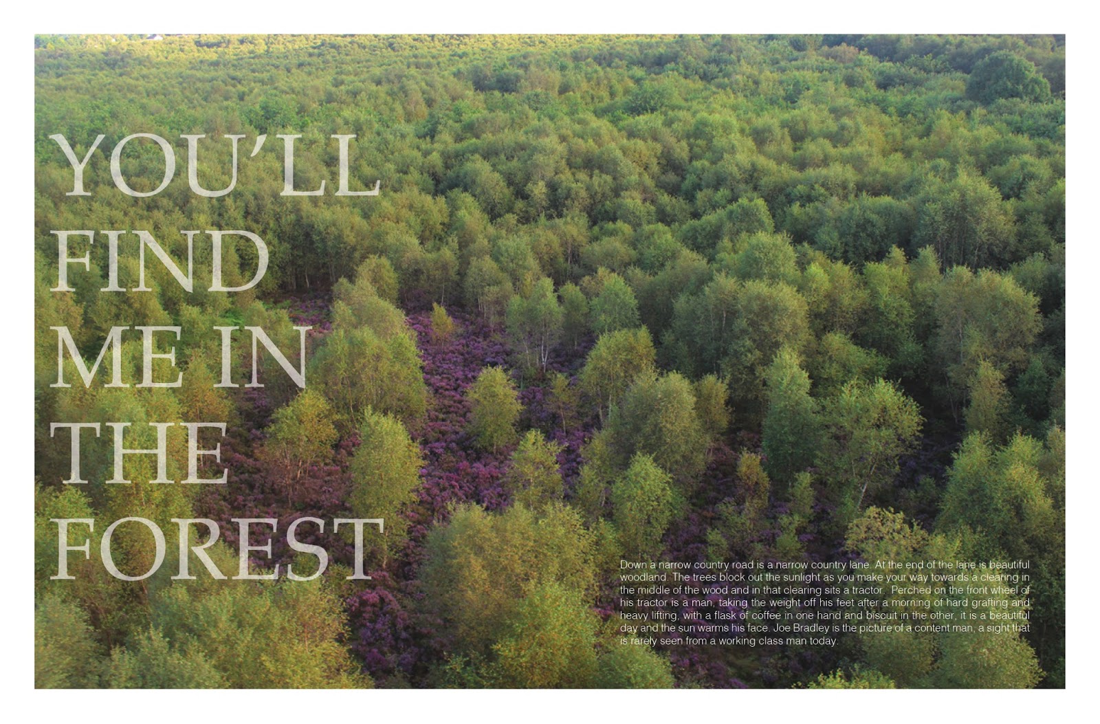
In my final semester of college now and my last stretch towards the finish line it almost seems surreal to be here but this is my chance to show case all my interests and fields of art that I want to pursue, photography, typography, graphics and editorial design. Combined with my huge interest in caring for our environment, maintaining our heritage, story telling and the Sperrins, a place that I am proud to live. I brought my focus towards creating a printed magazine that focuses on this beautiful landscape and the people that help to shape it.


Photo shoot with musician


I like the idea of interviewing people and getting to know what inspires them, what keeps them creative and what excites them, in their work, in their daily life and how they combine to help each other out. What ties a really interested interview together is an interesting photograph that allows the people who were there to get a feeling of what it would have been like to hear these stories and pointers first hand. The important element is how good the photo is, I have been practising my photography and looking to hon my skills in on parts were my photography was weak. I have noticed since beginning this project my photography has automatically improved (from my own perspective).